Your homepage is the busiest room in your business. It is where first impressions are made, trust is won or lost, and visitors decide in seconds whether to lean in or leave. Yet most homepages are designed to look impressive rather than to convert. Here is the anatomy of one that does both — section by section, from the top of the page down.
The hero: clarity beats cleverness
The first screen is the most valuable real estate you own. It must answer three questions instantly: what you offer, who it is for, and what to do next. A clever slogan that requires interpretation is a luxury you cannot afford here. Lead with a clear, specific value proposition and a single, prominent call to action.
Resist the urge to cram everything into the hero. Its only job is to earn the next scroll — not to tell your whole story in one breath.
Visual hierarchy and the F-pattern
People do not read web pages; they scan them. Eye-tracking studies consistently show visitors moving across the top, then down the left, in a rough F-shape, pausing only on whatever stands out. Good design works with that behaviour instead of against it.
That means a clear size order — big for the most important thing, smaller for the rest — generous spacing so nothing competes, and contrast reserved for the elements you most want noticed. When everything shouts, nothing is heard; deliberate hierarchy is how you guide the eye.
Social proof, early and often
People trust other people far more than they trust your marketing. The moment after you have made a claim is the moment to back it up. Logos of clients, a standout testimonial, a key result, or a recognisable name reassures visitors that others have taken the leap and been glad they did.
Every claim you make raises a quiet objection. Social proof is how you answer it before it is even spoken.
The problem, framed in their words
Before you talk about your solution, show that you understand the problem. When a visitor sees their own situation described accurately, they relax — you clearly get it. This section is not about you; it is about the frustration that brought them to your page in the first place.
The solution and its benefits
Now you earn the right to talk about what you do. The key shift is from features to outcomes. Visitors do not care that you offer a “responsive, SEO-optimised build.” They care that more of the right people will find them and get in touch. Translate every feature into the result it produces:
- Not “fast loading” but “visitors stay instead of bouncing.”
- Not “custom design” but “a brand that looks as serious as you are.”
- Not “clean code” but “a site that keeps working without constant fixes.”
How it works: remove the fear of the unknown
Uncertainty kills conversions. A simple three-step overview of what happens next — enquire, plan, launch — makes the path forward feel safe and manageable. People are far more willing to start when they can see the whole staircase, not just the first step.
Handle objections before they harden
Every visitor arrives with silent hesitations: is this too expensive, will it take too long, what if it goes wrong. A short, honest FAQ or a reassuring guarantee defuses these doubts in the moment they occur. Anticipating objections shows confidence, and confidence is contagious.
The mobile-first reality
Most of the people reading your homepage will do so on a phone, so every principle above must survive on a small screen. That means the value proposition fits without pinching, the call to action sits within thumb’s reach, tap targets are generous, and the page loads fast on a mobile connection. A homepage that only works on a desktop is a homepage that fails most of its audience.
The closing call to action
By the time a motivated visitor reaches the bottom of your page, they should not have to scroll back up to act. Repeat your primary call to action with a clear, low-friction next step. Reduce the ask to something small and human — a conversation, not a commitment — and make the button impossible to miss.
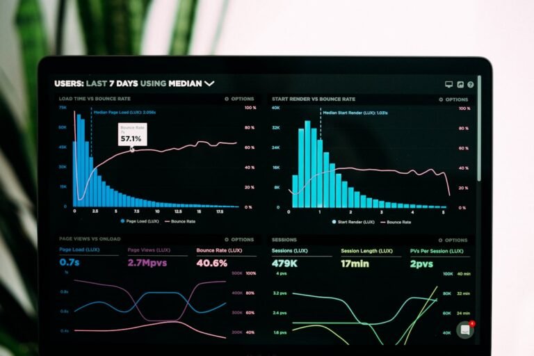
Measure, then iterate
A high-converting homepage is rarely right on the first attempt; it is refined. Watch how real visitors behave, notice where they hesitate or leave, and test one change at a time. Small, evidence-led improvements to your headline, your proof, or your call to action compound into meaningful gains over months. The best homepages are never finished — they are tuned.
Copywriting: the half nobody budgets for
Here is the uncomfortable truth about high-converting homepages: the words do more work than the design. You can place every section perfectly and still convert poorly if the copy is vague, self-centred, or full of jargon. Yet copywriting is the line item most businesses try to handle “internally” at the last minute, and it shows.
Great homepage copy is specific, written in your customer’s language, and relentlessly focused on them rather than you. It replaces “we are passionate about quality” with a concrete promise the reader actually cares about. It uses short sentences, real numbers, and verbs that describe outcomes. Every headline earns the paragraph beneath it, and every paragraph earns the next scroll.
If you take one thing from this article, let it be this: budget for your words with the same seriousness as your design. A beautifully designed page wrapped around weak copy is an expensive way to say nothing. Get the message right first, and the design has something worth framing.
Finally, remember that a homepage never works in isolation. It sets expectations that the rest of your site — and your business — must then honour. If the homepage promises clarity and speed, the contact page and the service pages had better deliver the same. Consistency is what turns a strong first impression into lasting trust, and trust is ultimately what converts.
The bottom line
A high-converting homepage is not a gallery; it is a guided journey. It leads a stranger from curiosity to confidence to action, answering each question in the order it naturally arises. Get that sequence right — clarity, proof, empathy, benefits, process, reassurance, action — and your homepage stops being a brochure and starts being the most reliable salesperson you have.