A patient sits on her couch at 9:15 PM with a dull, persistent throb in her lower molar. She opens Safari on her iPhone, searches for a practitioner nearby, and opens three local clinic links in separate tabs.
She is not looking for groundbreaking artistic design. She is anxious, tired, and looking for a concrete reason to trust someone with a drill in her mouth tomorrow morning. Most dental practice website design fails this test immediately by treating her like an attendee at a modern art gallery rather than a person in pain looking for clear answers.
If your site forces her to hunt through dropdown menus to find out who you are, what a checkup costs, or how to request an hour on your schedule, she closes the tab. She books with the clinic down the street that gave her clarity in thirty seconds.
Stock photos destroy patient trust
Nothing turns a hesitant patient away faster than a banner image of a model with impossibly white, perfectly straight teeth laughing into a bowl of salad. Everyone knows it is a stock photo. It conveys zero information about your actual practice, your actual staff, or the environment a nervous visitor will step into.
A nervous buyer wants to mentally rehearse their visit before they ever make a call. They want to see the parking lot, the front desk, the treatment room, and the people who will greet them. Real photography of your actual team and facilities reassures visitors far more than slick stock assets ever could.
Hire a local photographer for three hours. Take clear, bright shots of your receptionists smiling, your hygienists at work, and your treatment rooms clean and ready. Show the human beings behind the business.
Clear pricing stops the silent exit
Patients fear two things when visiting the dentist: physical discomfort and unexpected financial hits. When a site hides fee structures behind vague phrases like affordable options available or requires a phone call just to discover the cost of a basic cleaning, potential clients leave quietly.
You do not need to list every complex restorative procedure or surgical code on your homepage. Dentistry involves variables, and treatment plans change based on individual health. However, publishing transparent starting prices for routine services instantly builds credibility.
State the cash price or typical copay range for a routine exam, X-rays, hygiene visit, and emergency consultation. When you eliminate financial ambiguity up front, you remove the primary objection that keeps people from taking action.
Dental practice website design must prioritize friction-free booking
Count the number of taps it takes to schedule an appointment on a mobile phone. If a visitor taps Book Now and lands on an intimidating nine-field form demanding their insurance policy number, group ID, home address, and medical history before showing available times, they will abandon the process.
Save the exhaustive intake forms for the digital lobby check-in after the appointment is confirmed. The initial booking request should require four items at most: name, phone number, email address, and preferred day or time window.
If you are planning a custom site build, our web design service for professional practices focuses on building streamlined scheduling paths that capture leads without causing frustration. Every extra field you add to an inquiry form reduces completion rates by a measurable margin.
Put patient reviews where decisions happen
Most clinics relegate patient testimonials to a dedicated reviews page tucked away in the main navigation. Almost nobody clicks on that page. Patients assume a dedicated review page is filtered to show only glowing five-star praise, so they ignore it and look at Google Reviews instead.
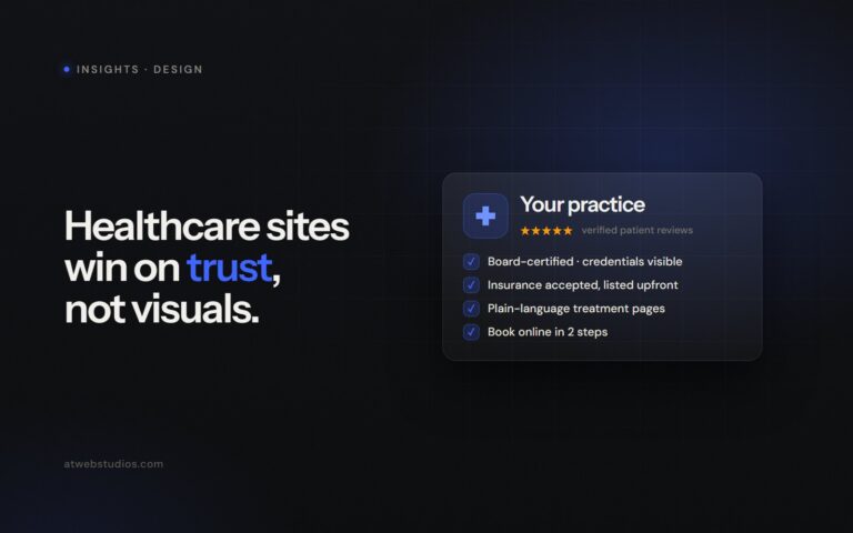
Bring your best social proof directly to the points of conversion. Place two or three brief, genuine patient reviews directly alongside or immediately below your online booking widget.
Anxious patients do not buy clinical superiority. They buy predictability, gentleness, and speed.
Focus on quotes that address common fears rather than generic praise:
- Specific praise beats generic compliments. A review mentioning that a doctor spent ten minutes explaining an X-ray creates far more trust than someone calling the office great.
- Contextual placement drives action. Anchor verified patient feedback directly next to your scheduling form where hesitation peaks.
- Recency matters more than total volume. A detailed review from three weeks ago carries more weight than fifty unverified star ratings from four years back.
Ditch awards carousels and autoplaying videos
Many healthcare sites clutter their headers with logos of regional associations, tiny award badges from five years ago, and automatic video tours that play without permission. These elements distract from your primary call to action and degrade site performance.
Autoplay video assets consume high amounts of mobile bandwidth, causing mobile layouts to lag and jump while loading. When pages take longer than three seconds to render on a cellular connection, bounce rates spike dramatically.
Keep your layout lean, static, and fast. Maintaining fast page load speeds directly impacts your visibility in local search rankings and keeps visitors from bouncing, which is why technical search engine optimization should always accompany clean design choices.
Audit your site on a phone tonight
Fixing your digital presence does not require a complete brand overhaul overnight, but it does require honest evaluation from the perspective of an anxious patient.
Step outside your office tonight at 8:00 PM. Pull out your phone, turn off Wi-Fi, and visit your practice URL on a mobile network. Try to find the cost of a standard hygiene appointment and initiate a booking using only one thumb.
If you encounter slow page loads, tiny buttons, hidden pricing, or confusing forms, your site is actively leaking patient bookings to competitors down the road. Fix those friction points first, and watch your schedule fill up.
Frequently asked questions
Why should dental websites avoid stock photography?
Stock photos hurt patient trust because visitors quickly recognize them as artificial and uninformative. Nervous patients prefer seeing authentic photos of the actual staff, parking lot, and clean treatment rooms so they can mentally prepare for their visit.
Should a dental practice website show prices for services?
Publishing transparent starting prices or typical copay ranges for routine procedures like exams, X-rays, and cleanings instantly builds credibility. Patients often leave websites silently if basic fees are hidden behind vague statements or require a phone call to discover.
What information should be on a dental practice online booking form?
An initial online booking form should ask for four items at most: name, phone number, email address, and preferred day or time window. Exhaustive intake forms and insurance details should be saved for digital check-in after the appointment is confirmed to prevent form abandonment.
Where is the best place to put patient reviews on a dental website?
Patient reviews are most effective when placed directly alongside or below the online booking widget where hesitation peaks. Most prospective patients ignore dedicated testimonial pages, so placing specific quotes near booking conversion points drives more action.